UI
Using the Canvas plugin.
This example shows how the Canvas plugin can be used to create ui elements on screen. It also uses the Color Rect plugin to draw those elements to screen.
auto canvas = commands.create().add(UICanvas{}).add(RenderTarget{}).entity();
We start by setting up a cubos::
        auto elementBg = commands.create()
                             .add(UIElement{.layer = 0})
                             .add(UIHorizontalStretch{20, 20})
                             .add(UIVerticalStretch{20, 20})
                             .add(UIColorRect{{1, 1, 1, 1}})
                             .entity();
        commands.relate(elementBg, canvas, ChildOf{});
Now we can set up a background, with a cubos::
We can add a cubos::
Finally, we have to set this UIElement as a child of the entity holding the canvas.
Besides the stretch components, the cubos::
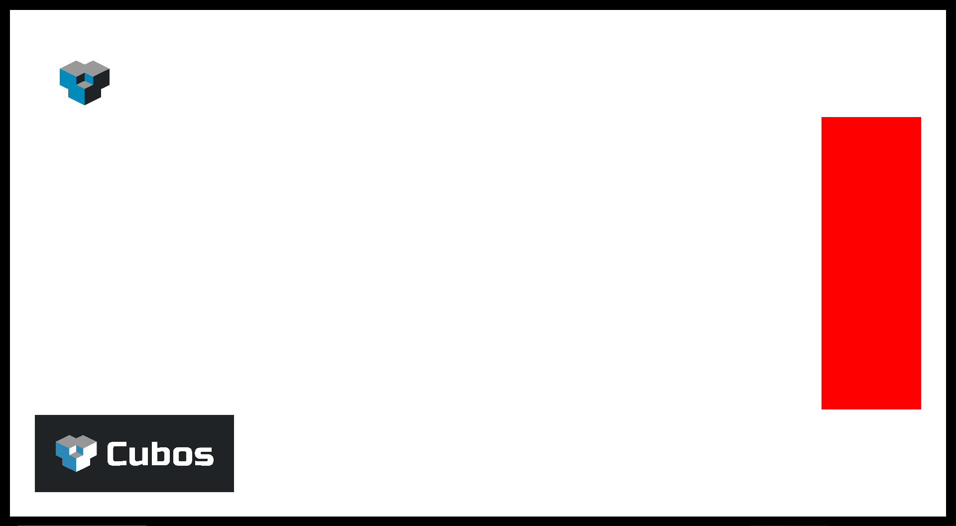
        auto elementPanel =
            commands.create()
                .add(UIElement{
                    .offset = {-50, 0}, .size = {200, 600}, .pivot = {1, 0.5F}, .anchor = {1, 0.5F}, .layer = 1})
                .add(UIColorRect{{1, 0, 0, 1}})
                .entity();
        commands.relate(elementPanel, elementBg, ChildOf{});
Here we create a small panel to the right side of the screen. The anchor is set to 1, 0.5. This will mean that the panel's pivot will be placed on the very right edge of its parent, and in the middle vertically. Then the pivot itself is set to also be 1, 0.5. This will mean that the UIElement will "grow" to the left horizontally, and equally up and down vertically. This is because by setting that value, we are effectively telling the UI element its pivot will be on its right edge, in the middle point of it. We set the offset to be 0, -50, so that we leave a little space to the right of the it before the edge of its parent. This space will be constant regardless of the parent's size. Finally, we se the size of the element to be 200, 600.
We set this panel as child of the background, and we'll paint it red.
Next let's add an image.
        auto logo =
            commands.create()
                .add(UIElement{.offset = {50, -50}, .size = {200, 200}, .pivot = {0, 1}, .anchor = {0, 1}, .layer = 1})
                .add(UIImage{AnyAsset("50423317-a543-4614-9f4e-c2df975f5c0d")})
                .entity();
        commands.relate(logo, elementBg, ChildOf{});
To add an image, it's a simple matter of adding a cubos::
We might, however, want to make sure that the image will retain its aspect ratio without having to manually adjust the element's size. The solution for that is the cubos::
For this we will the use the extended version of our logo, which is rectangular. You'll notice that the UIElement it's being attached to is a square, but due to the UINativeAspectRatio component, that square will be sized down into proper shape.
Another important thing to keep in mind while building the UI is how it is going to adapt to different resolutions and aspect ratios.
You can do this by using a set of components that when added to an entity with a UICanvas will change how it handles these differences. In this sample, you can change which is being used by pressing the shortcut numbers in the first collumn. All these components are meant to be used exclusively, meaning that no more than one should be present in one entity.
| Shortcut | Mode | Component | Description |
|---|---|---|---|
| 1 | Stretch | None - Canvas defaults to this when no other component is present | Canvas is stretch to fit the window. Will warp elements. |
| 2 | Keep Pixel Size | UIKeepPixelSize | Distances to anchors are constant. Might cause overlap between elements with different anchors. |
| 3 | Match Height | UIMatchHeight | Vertical proportions are kept. Width is adjusted to keep each element's aspect ratio. |
| 4 | Match Width | UIMatchWidth | Horizontal proportions are kept. Height is adjusted to keep each element's aspect ratio. |
| 5 | Expand | UIExpand | Switches between matching height or matching width, depending on which will cause the elements to reduce in size. |